
Talk That Talk
A mobile first vocabulary app designed to help adults learn new vocabulary.
The Problem
How might we design a mobile app that empowers people to learn new vocabulary?
The Goal
Help users learn new vocabulary confidently. Design an app integrates smoothly into users daily, weekly and monthly routines.
-

Duration
4 Weeks
-

Role
UX Research
UX/ UI Design
-

Tools
Adobe XD
Sketch
Miro

Research
Competitive Analysis

Chegg Prep
Pro’s
Can search through pre made flashcard packets
Breaks flashcard menu down into clear subject matters
Friendly atmosphere to design
Has multiple study options- you can use traditional flash cards or a multiple-choice format
Gives you a score after each round of flash cards
In the multiple choice section, the app lets you know in real time if you have made a mistake
Con’s
Must create a user profile in order to make your own cards
User decides if they are grasping the material, in flashcard mode there is no way for the app to check the user
No image based flash cards
Design is friendly, but at times crowded in it’s design

Quizlett
Pro’s
Quizlett live section, which allows users to study with other users or a teacher, so good for classroom integration
Has wide array of flashcard sets to work from
Has image and audio based flash cards
Along with flashcard learning, user has the learning options of: fill in the blank, matching and testing options
Can participate in “classes” with other users
Notifications option
Clear and easy navigation
Con’s
Must sign in on the first page and make an account before you can access any tools
Gives automated username that is not clear (my auto user name was “magesticshavekotte”) I just want it to be my name and for me to put it in
After creating an account you get a pop up for Quizlett plus, this pop up occurs before the user can begin searching the free version
Cannot check progress for free

Flashcards App
Pro’s
Can make manual cards, which allows for the user to create a personalized set of flashcards
Has dark mode
Has a “Your decks” home page where you can easily see flashcards you have made
Cons
“Upgrade to pro” advertisements everywhere and difficult to avoid, app is very limited unless you pay to upgrade
Has an alarm clock feature, but that doesn’t seem relevant to flashcard study

User Research
3 Participants - ages 28-32 - 2 with ADHD Diagnosis - Based in USA - All have received some level of Tertiary education

User Persona’s
-
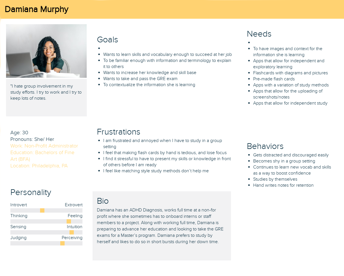
Damiana Murphey
“I hate group involvment in my study efforts. I try to work and I try to keep lots of notes. Other people get in the way of that.”
-

Alex Santiago
“I love feeling like I’m helping the community, but sometimes I feel more like an educator than a lawyer, its tiring.”
-

Allison Bracker
“I’m a social performer, and sometimes I focus more on being likeable than on my study needs.”

The Design Process

User Flows
Making the user flows allowed me to focus on the primary tasks of my user persona’s. With all apps, a lot can be designed into them but, by working with specific flows I can cut down on distractions and follow one task from start to finish, ensuring that my user can too.
The user flow process really helped me understand the contextual necessity of things like User Persona’s and User Stories, as a new UX designer I wasn’t sure how the persona’s played an effective role in app development, however once I started making flows based on what those imaginary users needed, the lightbulb went off! And I saw that by creating personas and designing to their perceived goal, the app’s complexity could be broken down into smaller, more human elements.
Wireframing

Usability Testing

Revisions
In my first set of wireframes, I added color elements too soon, which limited my ability to convey IA through
form, weight and placement. In the second iteration, I brought my color scheme back down to grey scale.


What I Learned
Talk That Talk is the first app I developed, what I learned most was how to put all the UX skills I had been learning together. Through this design process I better learned how one process fed into the other and how each element of the design thinking process played a necessary part in the success of a project. The iterative process allows for constant reevaluation and refinement, people are constantly changing and updating, the iterative process allows design to do the same
Pro’s
User Flows and Persona’s really help to make sure the app is constructed in a thorough and clear manner, where sections are designed in small groups and then assembled into a collective whole
Market Research and User Research really help define what a project needs and doesn’t need
Wireframing ensures that an app is designed with functionality first and style second
It’s okay for the apps initial problem statement to change, especially if user feedback points the project in a different direction.
Con’s
Usability testing in the early stages can be difficult, as sometimes the lack of build-out can cause distractions in the test.
Competitive Analysis can seem arbitrary without prior User and Market Research
