
End to End Design
Vela is a wind, water, and weather app designed to help weekend warriors plan their trips.
The Problem
Water sport enthusiasts need a meteorology app that includes wind, water, weather data along with destination details and guides so they can plan and enjoy their activities confidently and easily.
The Goal
Lets design an app that provides users with all the necessary destination details, like parking and allowed activities, while also provide them with weather data and suggested articles and guides about selected water sport activities.
-

Duration
18 Weeks
-

Role
UX Research
UX / UI Design
-

Tools
Adobe XD
Miro
Optimal Sort

Research
Competitive Analysis

WindFinder
Pro’s
Has good UI with a guided walk-through for new users
Includes radar map AND weather cam
Youtube channel component for in-depth learning
Weather includes wind and tidal information
Links to google maps/ apple maps for easy access to directions
Con’s
Does not provide any information about sites other than weather
Not available offline
Preloaded “favorites” section is unhelpful and not geographically accurate
Must pay to receive weather alerts

Windy.App
Pro’s
Available offline
Free for safety and service professionals (like lifeguards and park rangers)
Extensive information on wind and wave height
Interactive map makes it easy to search by location / sight
Provides information about site- usually takes you to state funded or private website for further details
Con’s
Doesn’t provide any kind of risk assessment
Overwhelming display
Difficult to change preset settings
Unclear differentiation between free and paid features

User Interviews
5 Participants - ages 28 - 65 - Based in USA - All participate in water related activities
Findings
As it turns out, most of our users were more interested in an app that helped them plan for a trip, and because they could not get past this part, never quite made it to needing an app that provides them with in-depth meteorology metrics.
So, I redirected my research a bit, came up with a mental model of what my users collectively go through when trying to plan for a weekend destination.
Mental Models
At this point in the research phase, I felt like Vela had shifted focus quite a bit. To make sure I stayed in line with my users visions and needs, I made a mental model for planning a trip. This helped me focus my context of use later on in the design process.

Affinity Mapping
Findings
Working with the new information I received from my interviews, I collected 25 highlights from my interviewee’s and sorted them in two ways: Postive, Negative, and Neutral and Destination, Planning, App use, and Reactions.
By doing this, I was able to come up with a prioritized list of things Vela the app should address first, second and third.
Need 1
App should have destination information like address, fare and rules
Need 2
Include Reviews, our users rely on them to make qualitative decisions
Need 3
Parking must be included, all users mentioned this was one of their biggest struggles
Need 4
Users enjoy looking at a radar map when researching weather
User Persona’s
-

Alice Yo
“I tried canoeing with my husband and really liked it! I’d like to try it again”
-

Katie Strauss
“I think the most challenging thing about open swimming is the visibility in the water”
-

David Murphy
“I have to go to like three different sites right now to get all the information I need about where I can surf- its so annoying.”
Card Sorting
Once I had my persona’s and my task flows, it was time to check in with my user base again. This time withe a focus on vocabulary and terminology.
A card sort was conducted so that we could best understand how our users described their needs. This data was used primarily for Page titles, labels and other forms of description used within Vela. By conducting the card sort, I was able to increase the learnability of Vela by designing it with terms and categories familiar to my users.

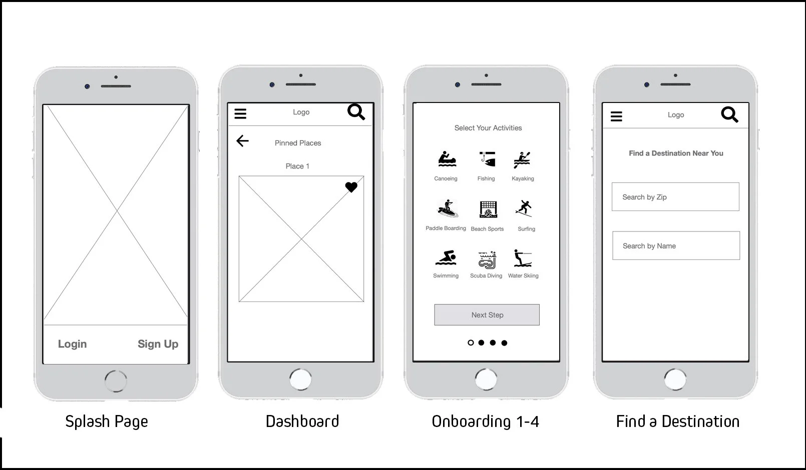
The Design Process
Low Fidelity Wireframes
Usability Testing
Remote Moderated Tests - 6 Participants - ages 28 - 40 - Based in USA
Issue 1
Distracting Image Carousel Arrows on Destination Profile Screen
Issue 2
Confusing Onboarding skill assesment
Issue 3
Low contrast IA
Issue 4
User review section too small

Mid Fidelity Wireframes


Hallway Testing
Once I brought all of my screens to the mid-fidelity level I decided to do some more casual user testing to see if my design choices were enhancing the UX of my project the way I wanted too.
I am so grateful for this decision. Vela’s original design, though artful, was not facilitating good UX.
A/B Preference Testing

Conclusions
- Users gravitated towards styles with higher contrast
- Users engage more when design was more graphic
- Users enjoyed the visual layout overall
- Onboarding button shading will be increased
- Opacity of background box in onboarding will be decreased
High Fidelity Wireframes
My previous AB testing and comments gained from hallway testing helped guide my design revisions. I decided to stick with a fairly monochromatic design and left the pops of color for features and alerts. My users responded best to a design that was more graphic than illustrative. The simple graphics and color scheme helped tamp down on information overload on some of the more data heavy screens.

Design Deliverables

Style Guide
Vela’s style guide lists all general rules for app design. This includes color palette, fonts, card sizes / uses, and icons.
Vela’s style guide is a living document and includes date of last update.
The style guide was designed to be a quick hand-off document and reference document. For more in-depth processes and protocols there is Vela’s Design Library.

Design Library
Design Libraries are living documents that include date of last edit/update at the top.
Vela’s design library includes both style notes and formats but as well as case of use.

What I Learned
Testing greatly improved Vela, both in style and usability.
For next time, I will keep my wireframes in grey-scale for longer. The implementation of design so early on distracted some testers.
Standard labeling format’s and clear design guides helped with design hand off (to my CF mentor) and for making changes between iterations.
Preliminary User and Market research created a solid foundation for Vela’s design and through it allowed me to create a product that was both memorable and desirable.
Challenges
I really struggled with not having a development team or UI team to refer too. This was mostly due to the “possibility” of certain design aspects. For instance, the Radar Map is something all of my users were interested in and in initial phases of the design I often found myself asking “yeah but can I even do that as a possibility?” Not being a developer and not having a development department, I couldn’t know. However, as I learned the steps of design and I began to understand more about UX market culture I realized that as a UX/UI designer it is OK to not know the answers to those kinds of questions. By MAKING the prototypes and wireframes, I could better ensure a developer who knew how to make a radar map could be added to the team if that was what was needed.